Cane That Reads Right: Choosing Furniture Tones for Real British Daylight
British daylight is not one thing. A conservatory can sit in flat grey for a week, then fill with a white glare that makes every cushion look as if it belongs to someone else. Cane furniture is especially sensitive to that shift. The same chair can read warm honey in a south-facing bay, pale straw under a north-facing roof, or distinctly orange beside a cool grey wall. That is why choosing cane for a UK conservatory is less about picking a favourite colour and more about choosing a tone that behaves well in the light you actually have.
Why British light changes cane colour
Cane, rattan and wicker are natural materials with a lot of surface variation. They have a sheen, a grain and a weave that catch light differently from painted wood or fabric. In a bright conservatory, that texture can look lively and warm. In a dim, north-facing room, the same piece can lose contrast and read as a flat brown shape.
Our skies also tend to be cooler than the light many furniture photographs are styled for. A cane tone that looks gently golden on a website can look almost orange against a blue-grey British sky. The reverse is also true: a washed grey cane that looks elegant in a studio can seem chilly and lifeless in a room that never gets direct sun.
The practical answer is not to avoid colour. It is to choose a tone with enough depth to hold its shape in soft light, but not so much red or orange that it fights the room when the sun comes out.
The tones that tend to work, and the ones that miss
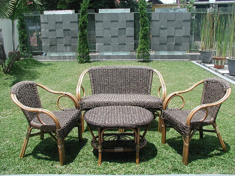
Natural honey and warm mid-brown cane are the safest all-rounders. They bring warmth to north-facing rooms without looking stark, and they usually sit comfortably with the off-whites, sage greens and soft blues common in British homes.
Pale washed cane, often called whitewash or natural ash, works well in small conservatories because it keeps the room feeling light. It is a good choice for a room with plenty of glazing and a pale floor, but it can look washed out against a white wall in a dull corner. If you love pale cane, add contrast through cushions, a rug or a darker frame.
Grey and driftwood tones are useful in very bright conservatories, especially where summer glare is a problem. They cool the room down visually. In a dark or north-facing conservatory, however, grey cane can look shadowy and a little institutional unless you warm it up with textiles and timber.
Deep brown and antique-toned cane can be handsome and grounding, but it needs space. In a narrow conservatory it can feel heavy, and in low winter light it may read as a dark mass rather than a woven texture. Use it for one anchor piece rather than a full suite.
The tones that most often disappoint are the very orange, red-brown finishes and the flat, uniform browns. Orange cane can look cheerful in a sunlit photograph, but against grey skies it can tip into a synthetic look. Flat brown finishes lose the natural variation that makes cane interesting in the first place.
Test samples where the furniture will actually sit
Never choose cane from a screen alone. Ask for a sample or a small offcut, or take home a cushion-sized piece if the retailer offers one. Place it on the floor where the furniture will go, not on a table near the window. Leave it there for a few days.
Look at it in the morning, in the afternoon and on a grey day. Check how it looks with the room lights on and off. If you are buying in summer, remember that November light will be cooler and lower. If you are buying in winter, try to imagine the room with the doors open and the sun higher in the sky.
A simple trick is to place the sample against a sheet of white paper, then against your wall colour and your floor. Cane that looks right on white paper can look entirely different next to a warm cream wall or a grey oak floor. You are not looking for a perfect match; you are looking for a tone that still feels right in all three settings.
Pair cane with paint, fabric and flooring
Paint is the biggest lever. Off-whites, clay whites and soft greys let natural cane do the warming. Sage, olive and muted blue-greens work well with honey and pale cane, especially in a conservatory that opens onto a garden. Strong terracotta or mustard walls can be lovely, but they will push cane towards orange, so choose a cooler, darker cane tone if you go down that route.
Cushions should add contrast rather than repeat the frame. Washed linen in oatmeal, slate blue or faded green will calm a warm cane suite. If the cane is pale, a deeper cushion will stop the furniture disappearing into the walls. Avoid bright orange or red cushions next to orange-toned cane unless you want a deliberately tonal, sunset effect.
Flooring matters more than people expect. Pale oak and limestone keep a conservatory light and make cane look crisp. Slate and dark timber add depth but can make a small room feel heavier, so balance them with pale cane and plenty of texture. Sisal and jute are natural partners for cane, but choose a rug with a defined edge so the furniture does not blur into the floor.
A simple checklist before you buy
Ask yourself whether the cane has visible variation, because a little irregularity helps it look natural in changing light. Check whether the finish is too red or too orange against your wall colour. Hold a cushion fabric next to the sample, not just the frame. Look at the piece from the doorway, because that is how you will see it most often. And leave a little breathing room around it, since cane furniture always looks better when its weave can be read.
British light will keep changing. The right cane tone is the one that still feels comfortable on a dull Tuesday in February and on a bright Sunday in July. Choose for that range, not for a single perfect afternoon.